 Mobile Support with Responsive Layout
Choose a Theme That Works
When you are choosing a theme for your site one and perhaps the most important aspect is how it will work in different devices. It’s important to make sure the theme you choose is responsive. As someone has said…
In 2010s - if your site is not responsive - it does not exist.
Even though the Back to The 90s WordPress Theme is all about 90s it still has a nice support for all kind of browsers and modern mobile devices.
Mobile Optimizations
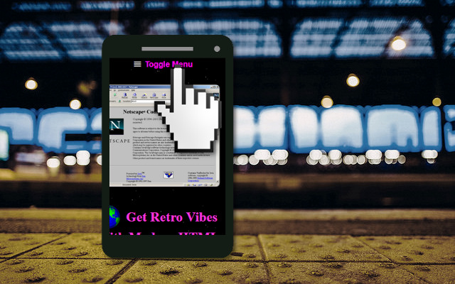
When the site is loaded in mobile browser the navigation menu is minimized by default, so the main content of your site is immediately visible. The menu can be opened by pressing the “Toggle Menu” button which is placed as the very first component on the page.
Back to The 90s Responds
The layout is responsive - no matter what are the dimensions of your browser and what kind of device you are using - Back to The 90s Theme looks good in phones, tablets, and desktop browsers all alike!